America’s Test Kitchen had an existing desktop-only cooking school product that had aged in both visual design and user experience. The redesign brought it into the ATK app as a differentiated tier, rebuilt around how people actually discover, choose, and learn from online classes.

Project Overview
The Problem
The existing Online Cooking School was desktop-only, visually dated, and built without the UX foundations that users expect from a modern product.
The Goal
Redesign the Online Cooking School as a mobile-first experience that feels modern, is intuitive to use, and lives within the existing ATK app as a clearly differentiated premium offering. ATK’s broader push was to establish the app as the definitive way to experience everything ATK has to offer. Bringing Classes into the app as a premium tier was a direct expression of that strategy.
Challenges
Premium feel within an existing brand. Classes would live inside the ATK app but come at an added cost. It needed to feel distinct and elevated without appearing like a different product entirely.
UX debt. The original product was missing many of the fundamentals users expect. The redesign wasn’t just a visual refresh—it required rethinking the information architecture and every core interaction from the ground up.
Tight timeline. Seven weeks to go from discovery to final handoff left little room for extended exploration. Every decision had to be intentional and efficient.
My Role
Team
PM, Researcher, Engineer, Creative Director
I came into this project as a short-term contractor and needed to get up to speed quickly. I ran workshop with the ATK team to understand everything they already knew: existing research, pain points, and how the product was actually being used. We then generated "How Might We" statements together, which I synthesized into key themes and prioritized with the team to define the project's focus.
I also ran a competitive analysis of both cooking and learning apps. Instead of a general audit, I tied the findings to our highest priority goals for launch. For each goal, I showed stakeholders which competitors did it well, using real examples to set the bar and prove it was achievable.


Because Classes was a premium offering living inside the existing ATK app, my design choices needed to signal that it was a paid upgrade and also relate back to the parent brand.
I didn't create a brand new visual language. I reworked the existing colors instead. White backgrounds replaced pink, black buttons replaced red, and the brand red became an occasional accent. It still felt like ATK, just cleaner and more premium.

The biggest decision users make in ATK Classes is typically, “which class should I take?” With over 300 classes available, we wanted to make sure users had exactly what they needed to decide whether a class was right for them.
Testing revealed that users had trouble sifting through the many classes available and didn't always know what to search for. There was an opportunity to put more relevant classes in front of them to increase engagement. To address this, we introduced a lightweight, 3 question onboarding flow, that feeds into a personalized class recommendations section on the dashboard, making it easier for users to find content that fits them from the start.


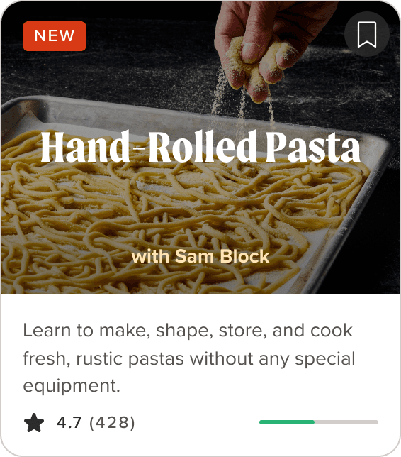

New Standard Card
I assumed users would expect to see class overview first, so the original design opened with one. Testing proved this wrong. Once inside a class, people consistently skipped the class summary and went straight to the lessons, because the lessons were what helped them decide. So I flipped it: the class now opens to the lesson list with the overview as a secondary tab.

Introducing Cook Mode
I introduced a feature called Cook Mode — a dedicated, distraction-free screen for following a recipe step-by-step.
A common frustration with cooking from a phone is scrolling back and forth between ingredients and steps. Cook Mode fixes that. Each step gets its own screen with a photo, the ingredients and amounts it needs, and any equipment.

User Testing
With only seven weeks, testing had to move fast and feed directly into the design. I worked closely with a PM and researcher to create scripts and define questions we wanted to answer. We ran three rapid rounds, each with a focused scope.
Round 1: Navigation
We put early prototypes in front of users focused on one question: can people move through a class naturally? This surfaced the friction in the original linear structure and validated the direction toward flexible, non-linear navigation with persistent controls.
Round 2: Content
Once navigation felt solid, we shifted focus to content and decision-making — what information do users need, and when? This is where we learned that users wanted to see the lesson list first rather than a class overview, and validated that the class card wasn't giving them enough context to commit.
Round 3: Full experience
The final round covered end-to-end flows with learnings from rounds one and two applied. This is where we validated onboarding, Cook Mode, and the overall structure before moving into final handoff.

Outcomes
Designed, tested, and prototyped the full experience in 7 weeks, working with a PM, researcher, engineer, and creative director
Created a premium "brand within a brand" look that ATK could carry into other products
Made it easier to find the right class with a 3-question onboarding flow that feeds personalized recommendations
Made a library of 300+ classes easier to navigate through user-testing-informed information architecture
Introduced Cook Mode, which solves the back-and-forth scrolling that makes cooking from a phone frustrating
Handed off a clear plan for next steps and fast follows
13.5K classes memberships through app confirmed since launch (April 2025)